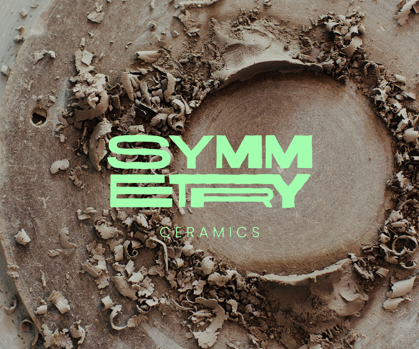
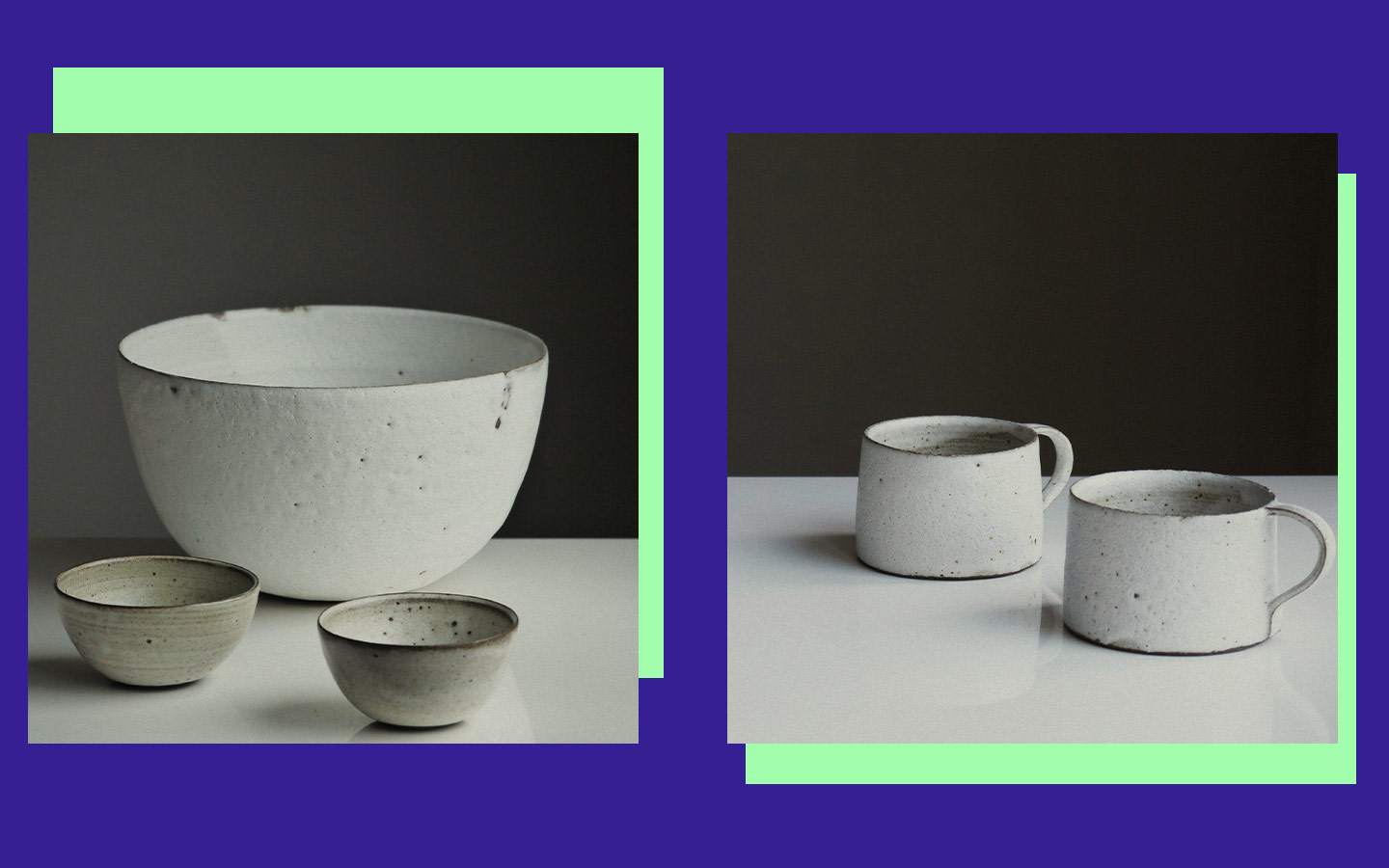
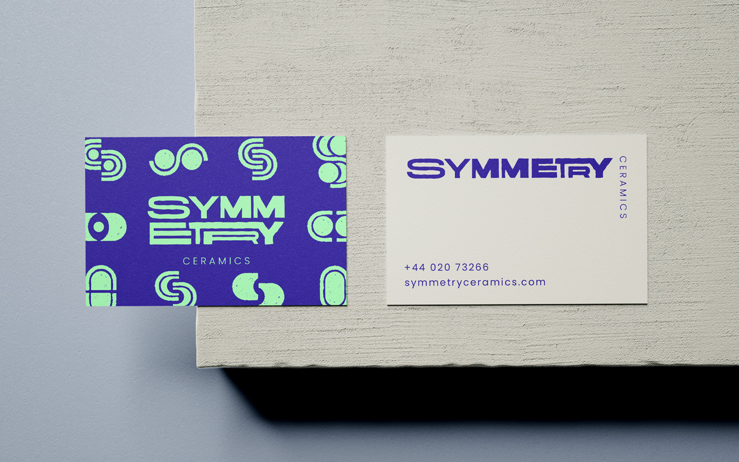
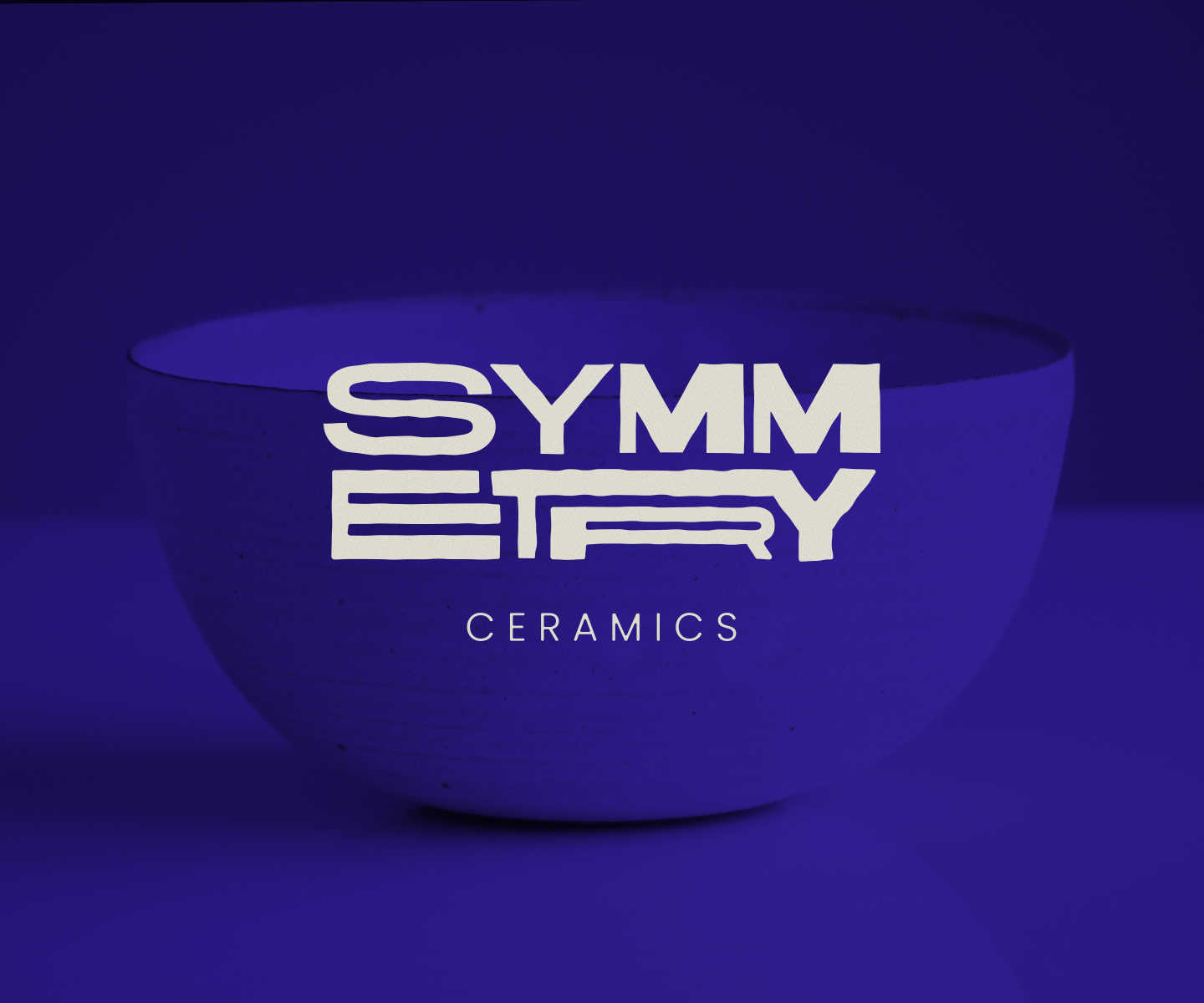
Brand identity and development for a ceramics brand based in the UK.
Role
- Art Direction
- Brand Identity
- Design
Having an interest in pottery and ceramics, this brand concept grew from the very simple idea of a circular ceramic plate.
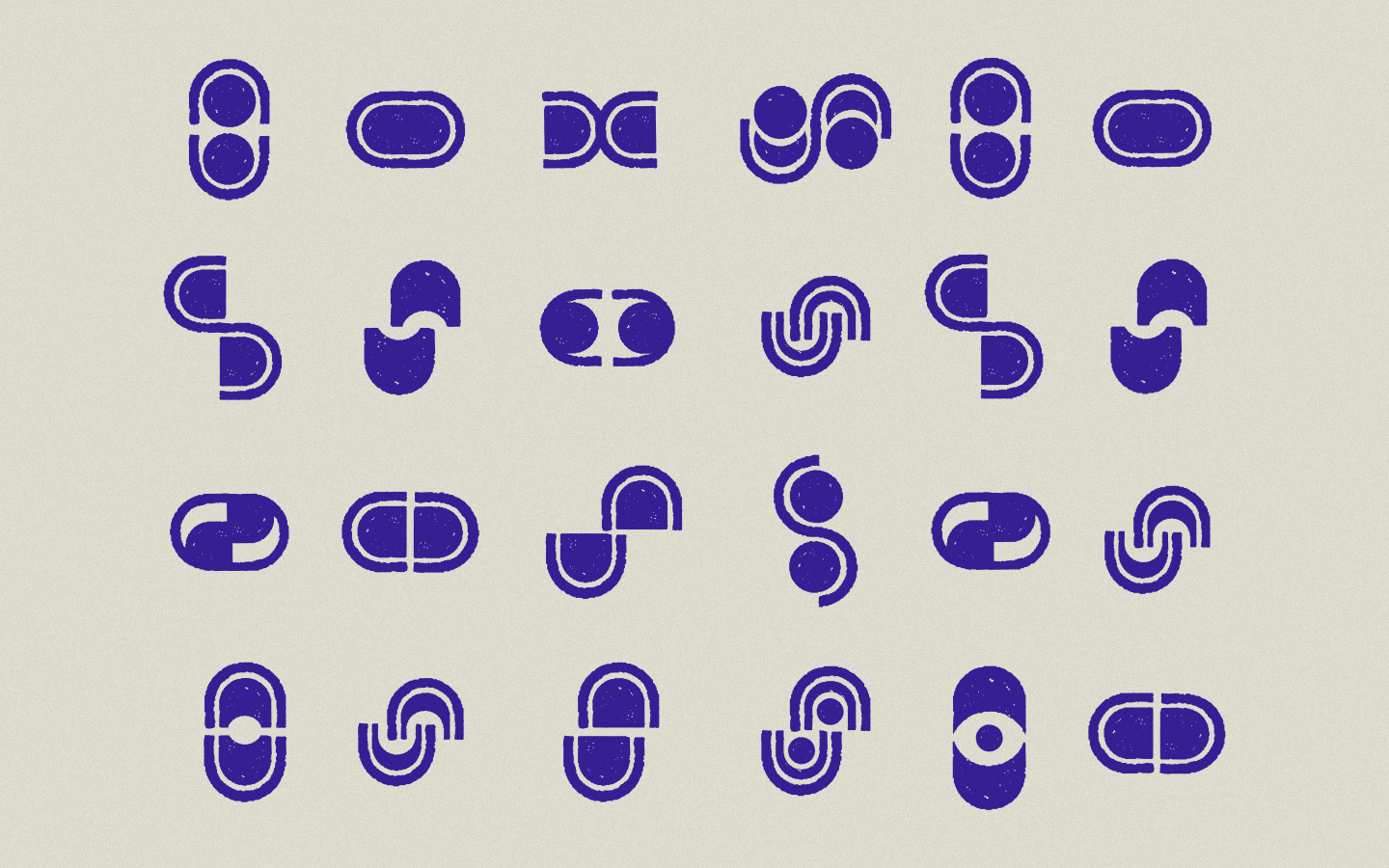
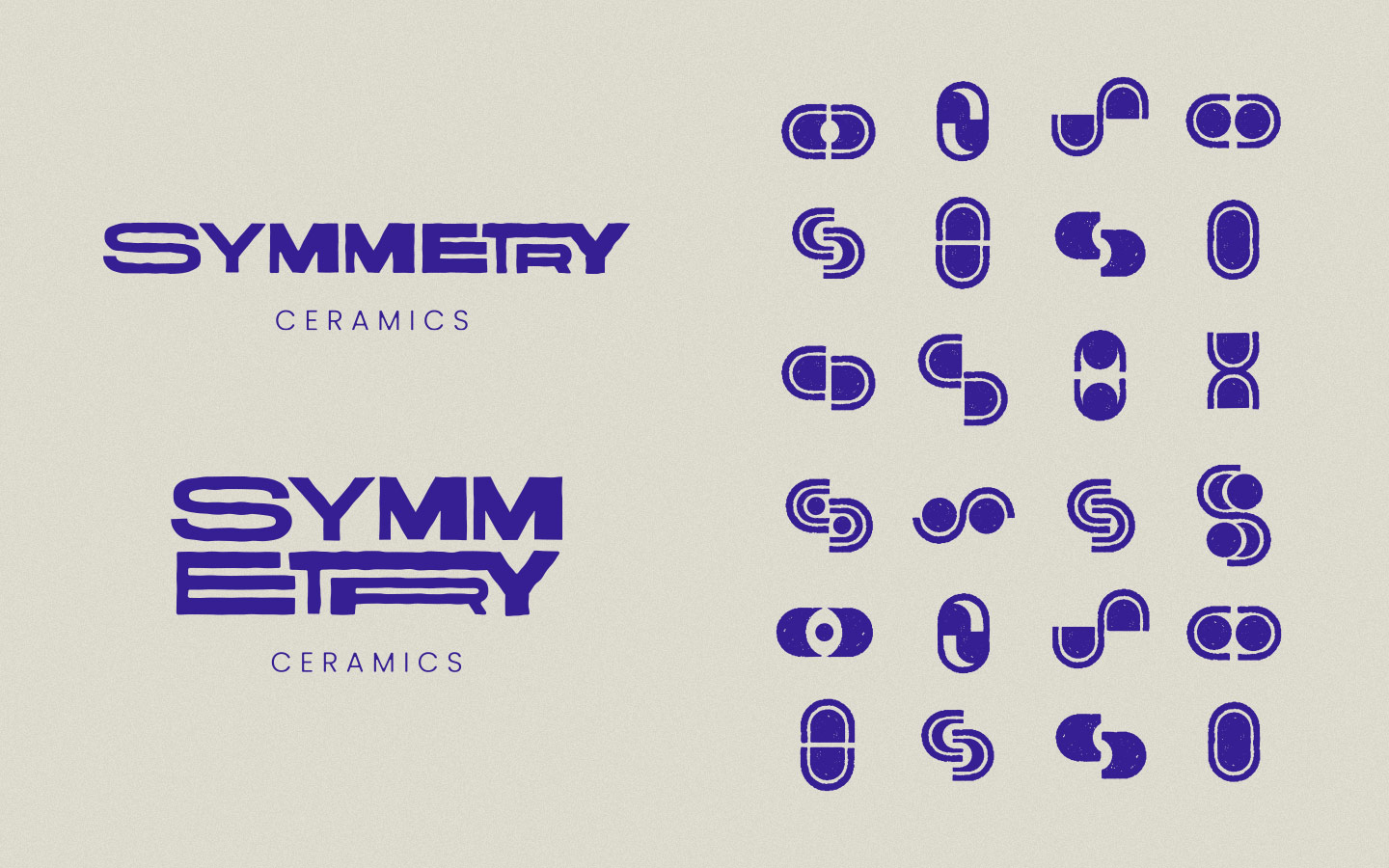
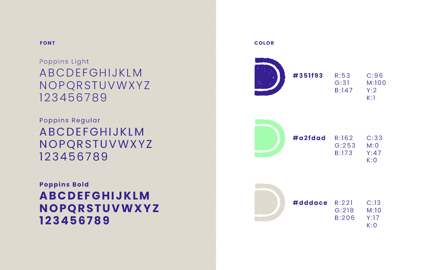
The exploration started with a series of 24 hand-drawn, symmetric shapes that became the core pattern component and incorporating a subtle roughness into the custom logo mark represents the organic quality of clay. A bold color palette aims to differentiate from the typical earth tone hues associated with pottery.
Additionally, a hand-drawn, morphing logo animation further communicates the brand subject matter.
